
SHEchange's Chrome extension conveniently notifies users of corporate social responsibility data/company ratings as they shop online, empowering users to make educated purchasing decisions that align with their values.
SHEchange’s core mission is to empower users with company data they can use to make better buying decisions and collectively influence companies to adopt better policies for people and the planet, for example: pay equity, ethical supply chains, and animal rights.
Our team was tasked with improving the existing UI/UX of SHEchange’s Chrome extension and website to quickly communicate value to users and increase engagement.
How might we make data meaningful enough to inspire action? How might we make it easier for users to find information they value?
Product Designer
10 weeks
For SHEchange's mission to succeed, users needed to feel compelled to action by the data provided through their Chrome extension. What did users think about the data?
During our initial testing, most users were confused by the data they saw. They questioned the data’s credibility and relevance. Only 2/7 users were able to describe what the company ratings meant.


Leveraging best practices gleaned from heuristics evaluation and competitive analysis (and after multiple iterations), we created a consistent, standardized style for the presentation of company ratings data. Users found it easier to evaluate the data and assess alternative companies.


As part of the re-design, the founder also wanted new features (enhancements) to encourage user engagement. This included a different ‘Compare’ page that is triggered when users are looking at a company’s product page.


Users were excited to see company ratings for causes they cared about. With reduced cognitive load, users were able to quickly evaluate data and focus on actions that aligned with their values. Comprehension testing of our redesign showed significant improvement. 7/7 users were able to describe what the company ratings meant compared to only 2/7 before the redesign.
See clickable prototypes of the full redesign below:
Skip to Details ↓
Although SHEchange provided some research materials, it was limited to a small portion of users that were already ethically-inclined. To grow their user base and generate income from affiliate partners, the founder also wanted to target less ethically-inclined users, where shopping ethically wasn’t top of mind, but something they would incorporate more of under the right conditions.
A few insights about these users from our user interviews were that they:
Based on our research findings from comprehension testing, competitive analysis, and heuristic evaluation, we prioritized three areas of improvement:
To address them more efficiently, we split into smaller sub-teams. I worked on the teams to improve the information architecture and data visualizations, with a personal focus on the UI/UX of the Chrome extension.
During our initial research with comprehension testing, only 3/7 users were able to find information about where SHEchange’s data comes from. Results from tree testing provided further proof that users had difficulty finding information on SHEchange's website.
To help users find information quickly and easily, we conducted both open and closed card-sorting to understand users’ mental models.
We then reorganized SHEchange’s sitemap to reflect insights we gathered: combining related information under new categories, surfacing information that users cared about its global navigation, and removing unnecessary duplicates.


We had further refined the sitemap by aligning its global navigation to a user journey we developed.

With the new sitemap, 5/7 users able to find information about where SHEchange’s data comes from, compared to only 3/7 users before the restructure.
UsingTreejack, we conducted tree testing with two groups of users. We asked both groups to complete several tasks with one group using the current sitemap and the other group using the new sitemap.
For 8/9 task scenarios, users were more successful with the new site map than the current sitemap.
During our initial research through comprehension testing, my team and I had discovered the following pain points:


From our user interviews, we developed job stories to further inform our designs.
We held several design sprints to sketch out ideas and vote on the ones we thought worked best. During this stage, I had sketched designs for the Chrome extension and Search Pages.

The best ideas were combined and translated into lo-fi wireframes and a lo-fi prototype that we tested with new users and presented to the founder for feedback. Designs were further refined through mid-fi and hi-fi iterations, incorporating the feedback we’d received.
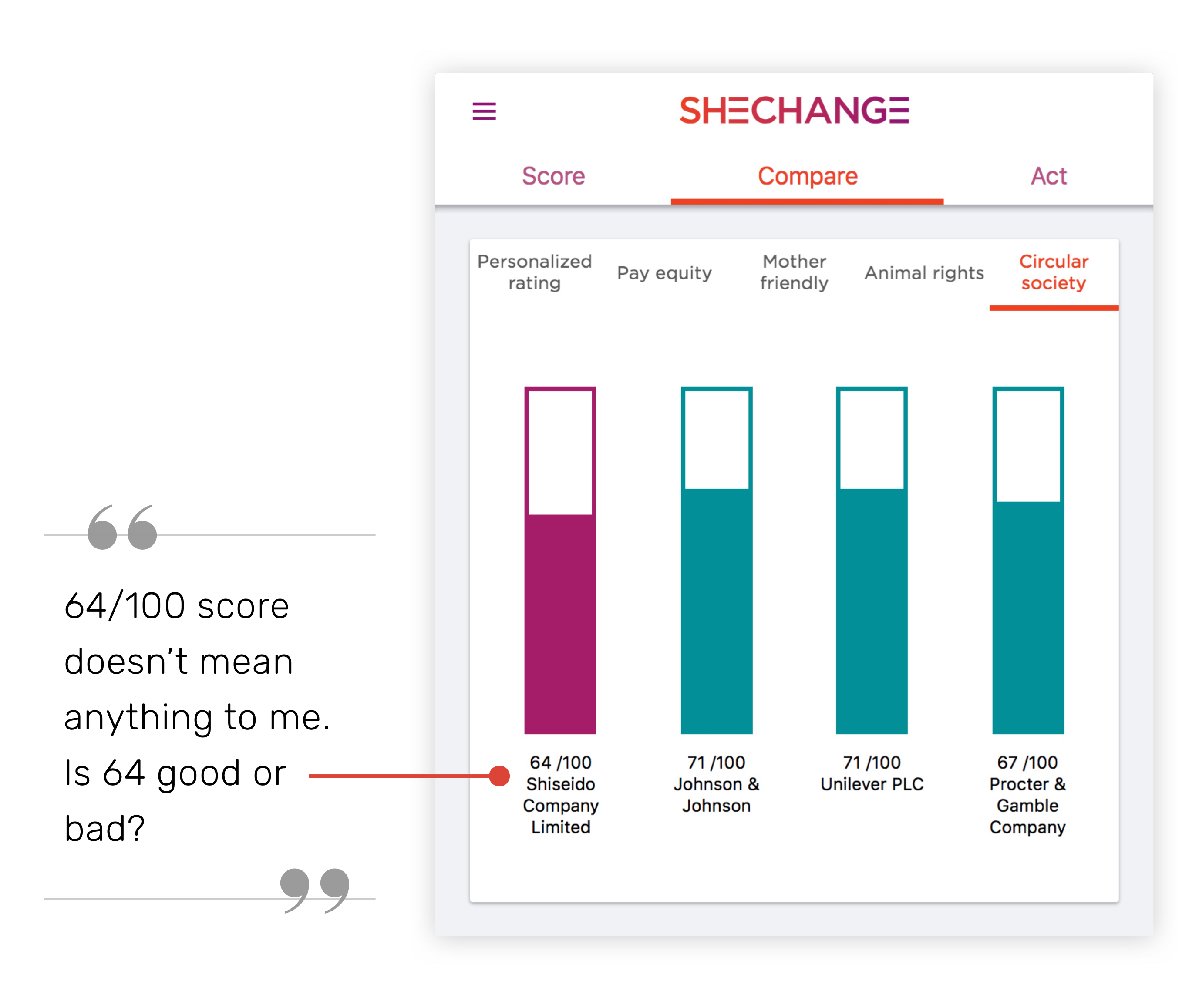
Below are the different versions of the data visualizations on the Chrome extension’s compare page that I designed. This compare page is triggered when a user is looking at a product page, providing alternative product suggestions.


From Version 3 onwards, images and prices of product alternatives were removed due to limited engineering resources. The founder plans to add them back in later when more resources are available.


See clickable prototypes of the full redesign below:
After each iteration, we tested our prototypes with new users to verify if the changes made any improvement. There was improvement in all areas.
A few users even asked to be notified when the updated version would be released. They couldn’t wait to find credible company ratings for causes they cared about all in one place instead of searching multiple websites and articles.
 Back to Results ↑
 I really enjoyed the opportunity to delve into user research with this project. It was an eye-opening experience to learn about the different motivations behind user decisions.
If I were to do again, however, I think I would have cut a few research methods out, such as open card-sorting. Though it provided some insight into users’ mental models, we could have come to the same conclusions with just closed card-sorting. It wasn’t necessary to do both and more time could have been allocated to lo-fi iterations.
We handed over the deliverables to SHEchange and they are currently working on a update to their website and Chrome extension.
“ You have all been absolutely amazing. Thank you so much for your hard work, diligence, creativity and fantastic commitment to this project and our success! ”
– Tracy Wyman, SHEchange Founder
